MedForm helps patients easily access, share, and update their medical information.

Product
Mobile application
Services
Product Design
UX/UI Design
UX Research
Branding
The Challenge
The experience of patient intake and onboarding in American healthcare is often strenuous, tedious, frustrating, and filled with redundancy. As patients are seeing new providers, referred to other clinics, or even attending return visits, they are frequently tasked with providing the same information repeatedly. The information being requested is often uniform across healthcare systems, with little variance from provider to provider. An improved patient intake and onboarding tool could provide an opportunity for simplification, organization, and transparency for both patients and healthcare workers who are burdened with repeating this experience time and again.
The Solution
A mobile application that functions as a universal patient intake form, allowing users to complete the form ahead of time and share with their medical provider.

Foundational
Research

I performed user interviews to grasp the motivations and goals of potential users and completed a competitor analysis in order to gain insights into the product landscape.
I wanted to specifically understand:
  • How patients access and control information related to their medical history.
  • Frustrations or challenges that patients have in finding, establishing, and maintaining healthcare.
  • What types of resources could patients see practical benefits from.

Competitive Analysis

What need is not currently being met?
I began my analysis by searching for what mobile apps are currently in market that help patients access, save, and share their medical information, and closely examined the top results (Sync.MD, Medical Data Box, Tidy Health, OneRecord). I also looked at MyChart, which is the top health app in the IOS store and is used by healthcare systems throughout the United States for patients to access their electronic medical records and manage their healthcare.

I found that all of those apps take various approaches to giving patients access to their medical information. 
Some allow users to integrate with their official records or upload their own details, and other apps give users the ability to share their information. What I didn’t find on the market was a feature that makes the patient intake and onboarding process easier universally. The closest example of this experience that I could find was with MyChart, which is limited to the providers that use Epic’s EMR system.
Snyc.MD
Universal intake
Ability to share
EMR integration
Security information
Family Accounts
Medical Data Box
Universal intake
Ability to share
EMR integration
Security information
Family Accounts
Tidy Health
Universal intake
Ability to share
EMR integration
Security information
Family Accounts
MyChart
Universal intake
Ability to share
EMR integration
Security information
Family Accounts

User Interviews

I compiled all user feedback into an affinity map.
Here are my key findings
Lack of access to medical history
Users are frequently unable to recall or access individual or family medical details. This creates challenges in providing necessary information when seeking care for themselves, dependents, or aging family members.
“I don’t think the process for accessing medical records is simple at all. For me, it’s a challenge, but for getting the records for my family I think it would be impossible.”
Kate
User Interview Participant
Users seek more control over their medical information
Participants expressed interest in a resource that would allow medical information to be accessed, shared, and updated easily.
“It would be great to have my medical information in my own control. I would have the record, I could share it with who I want, it would all be comprehensive and right there and I could see who I’ve shared it with, that would be nice.”
Rachel
User Interview Participant
Constantly asking for the same information comes at a cost
Patients say they are asked to provide the same information over and over again when seeking care. This redundant questioning reduces confidence that providers are working with accurate and comprehensive records and information.

Persona

Understanding who I'm designing for

Define & Design

I took what I had discovered during the foundational research phase and began ideating on potential solutions, ensuring that my designs prioritize user goals as well as adhere to any technical considerations.
Problem Statement
Patient intake and onboarding processes in American healthcare present several challenges:
  • Patients endure frustration and time wastage from repeatedly providing the same information.
  • Patients lack confidence that providers are working with accurate and comprehensive records.
  • Patients struggle to recall or access important medical details.
POV
I would like to explore ways to help patients better share medical information because the current processes are redundant, frustrating, and do not instill confidence that providers are working with accurate information.
HMW
How might we help patients easily access, share, and update medical information?

Key Features

The Solutions

Universal Intake Form

This feature directly addresses our users need to better access and control their own medical information, while also promising to save patients time at the doctor’s office. Here, users can access and update their medical details and history within clearly labeled and intuitively grouped sections.

Smaller details that improve upon the foundation of the form include an indicator for when the form was most recently updated, numbered labels that display a user’s progress to completion on any given section, and an option to preview the form that includes all of the information the user has added to it.

Share Form

Once a user has filled in the Universal Intake Form with their information, the primary action that they will take within the app will be to share it. It’s crucial that users can do so quickly and easily. This need is reflected in the design of the home screen, where the share button is enlarged and given priority placement. Users can share the form through two methods: a QR code for in-person shares and a personal link to account for online interactions.

To ensure the security of sensitive private health information, a confirmation step needed to be designed into the task flow and account for both online and in-person instantaneous sharing. After the form is shared but before it can be accessed by the recipient, a timed permission request is sent to the user where they are prompted to approve or decline granting access.

Extra Requests

While a universal intake form can account for the vast majority of information that is often requested by providers across the healthcare spectrum, setting-unique questions are common. Providers are able to ask these “Extra” questions by including them in a special type of request that is sent to patients to complete prior to their appointment.

Usability Testing

Key task flows were designed into a clickable prototype
Task Completion & Ease of Use
6/6 users were able to complete all three tasks with little to no error.
Positive Feedback
Feedback on the overall look and feel of the app was very positive. 6/6 users said they would be very likely to use this app.

Usability Testing

Iterations
Why did I make this change?
I initially designed the permission approval process flow to be accessed through a notification once a user had theoretically shared their patient QR code. My thinking was that I needed a way to prompt the tester into action since they would not literally be sharing their QR code in the prototype. While this presented no issue during testing, multiple testing participants said they frequently do not allow notifications for apps and only approved it on the prototype because they knew that’s what they were supposed to do. This feedback is what prompted me to reconsider how this should be designed for the prototype.

Once I began ideating I realized this flow just makes more sense for a QR code scan, which is happening in the moment to the user. No action should be required and the change should be immediate once the QR is scanned.
See Prototype

UI Phase

Branding & Visual Designs

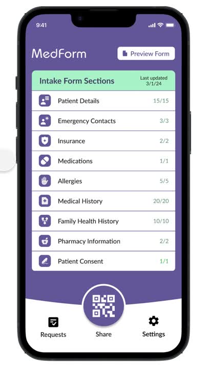
I wanted to create a patient-centered brand that communicates transparency, security, and practicality while evoking a sense of control that patients rarely feel in this frustrating part of life.

Here's how I did that:

Logo
My focus when creating the logo and word mark was for a pairing that appears legitimate and active, appearing as a stable resource in a space where brands and apps can feel empty or spammy.
Colors
I chose hues of purple as the foundation for MedForm’s pallet to reinforce a focus on stability and legitimacy.  I picked several greens in addition to those purple hues to create a pairing inspired by nature, attempting to mimic the calming vibes of a field of lavender in the spring.
Iconography
I designed an icon set that uses symbols that are as straightforward as possible and supportive of the groups of information they are representing.
Colors
Logo
Icons

Lessons Learned & Next Steps

Understanding user goals early helps make decisions during design later.
A primary constraint for this project was time. The brief limited the total hours of work to 100. This forced me to be selective with my time and prioritize what would go into the MVP.
Given more time I would:
  • Design out how users who are medical providers will use the app and access shared forms.
  • Explore EMR integration and automatic form updates.
  • Add linked and family account capabilities.
  • Expand testing efforts before shipping to market.

Next Up

NBA Mobile App